Campaign Impact Map
| for | Dogwood Initiative |
| status | live |
| as of | April 2015 |
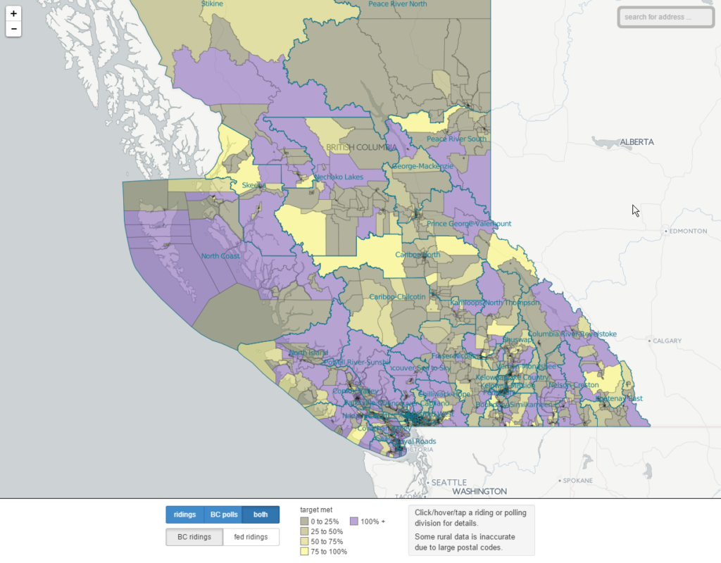
A poll-by-poll, real-time mapping of Dogwood’s efforts to sign up pledges, designed to provide hyper-local targeting of boots-on-the-ground engagement effort, and instant gratification to volunteers.
Dogwood Initiative have an ambitious plan. They contend that if the Enbridge Northern Gateway pipeline is approved, they will force a public vote using British Columbia’s public referendum mechanism. Triggering a referendum has a high bar: collect signatures from 10% of the voters in every riding in the province, within 90 days.
Dogwood’s solution has been to make it a two stage process: collect pledges from 10% of BC’s voters gradually and in advance, and be ready to activate those pledges when and if the 90 day period comes.
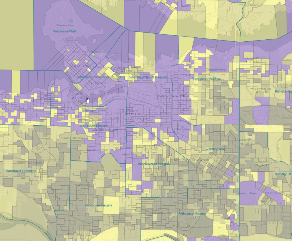
That means not just signing up a lot of people in the urban core of big cities, but signing them up across the entire province. And that means a distributed team of empowered volunteers, who know where they need to go and are enthusiastic about making their goals. To that end, Geocology worked with Dogwood to craft a real-time interactive web map that would show how close they’ve come to their target number of pledges, in every riding and in every single poll in the province.
(The map is displayed embedded in various contexts.)
There were a lot of challenges to this project.
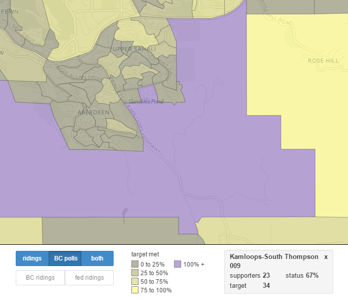
- We needed to know what voting area (an area of a few hundred people) everyone who has signed a pledge lives in.
- We wanted to visually show how close, or far each poll or riding was from its target in a way that was quickly scannable.
- All of the polling divisions in BC makes for a huge spatial dataset. How do you stuff that into someone’s browser?
- Dogwoods data lives in Salesforce: a powerful but old-school and somewhat cantankerous contact relations manager. If we wanted volunteer’s efforts to show up on the map pronto, could we get the data out of the CRM and onto the map, in something like real time?
- Some people think in terms of provincial politics, some in federal terms. Could we give both groups what they want?
- Red-green colour schemes are the easiest to understand, but BC has both a red and a Green political party, so you can’t really use red/green for anything that could get confused with that.
How did we do it?
First there was some pretty epic data munging. Using PostGIS we matched up every postal code in BC to a riding and polling division. If that sounds simple, it’s not. Postal codes can be strange and irregular critters, and doing that matching reasonably reliably takes some GIS know-how and postal code experience. Luckily, we’ve got that.
Then we imported all of those electoral boundaries into CartoDB, an awesome online spatial data storage, manipulation, and visualization platform. That way we can offload the task of compositing the many megabytes of finnicky polling division boundaries and sign-up colour classes into pre-baked map tile images that browsers can easily load in.
Then we wrote some custom mapping code using the marvelous Leaflet web-mapping library. That let us build a highly interactive, highly customized interface for users to control precisely which view of the map they want to display, and roll their mouse over the boundaries to see the values of interest flash in a data box.
Finally, we used Salesforce’s moderately awesome REST API and some Python scripting to wire it together in real time. Every 5 minutes the data gets totted up in Salesforce and then copied into CartoDB.
Presto! And the results have been great. Volunteers have responded strongly to a highly visually artifact of their hard work, and a reminder of where there work can still pay off. “I’m going out there and turning that block purple!” is a thing I have enjoyed hearing.